UI/UX best practices for Stitch Pay by bank, Manual EFT and Cash
Our design team shows how small optimisations in the payments experience can contribute to increased conversion, reduced cart abandonment and a higher degree of retention through an intuitive, user-friendly UI/UX in the payments flow.

Last year, over 70% of South Africans made some form of digital payment. The dramatic rise in online spending is only expected to grow, with the e-commerce market predicted to reach more than R400 billion annually by 2025, from more than 1 billion transactions.
This growth also means businesses across verticals face increased competition to attract and retain consumers. Looking at ways to optimise the full customer journey – from the shopping experience to the checkout and payment process – is crucial for businesses to differentiate and stand out in today’s crowded digital commerce space.
Whether a consumer engages with your product or service via an app or website, or even in-store, they’ve increasingly begun to expect an ‘invisible’, seamless and frictionless payments experience – with trust at the bedrock of it all. In our research report on digital payments preferences in South Africa, 57% of respondents indicated speed and ease in the payments process would convince them to choose one online platform or app over another.
Over the last few years working with clients to increase the efficiency of their payment flow, we’ve learned a lot about best practices that can contribute to higher conversion and an overall better user experience, resulting of course in more revenue for the business. Here, we take a closer look at how small optimisations in the payments experience can contribute to increased conversion, reduced cart abandonment and a higher degree of retention through an intuitive, user-friendly UI/UX in the payments flow.
For the purpose of this article, we’ll focus specifically on Pay by bank, Manual EFT and Cash methods for wallet-based businesses.
The role of UI/UX in the payments process
When introducing a new payment method, it’s important to introduce the method to your customers and maintain a level of trust and clarity so they know their money is safe and so that they understand why they should choose one method over another. It's also important to ensure the flow and process is as fast, seamless and friction-free as possible. This is where UI/UX optimisation plays a significant role.
Briefly, user interface (UI) refers to the interactivity, look and feel of a product screen or web page, while user experience (UX) refers to a user’s overall journey and ease of experience with the product or website.
Humans have a limited capacity to process and retain information. Introducing any unnecessary steps or complexity within the payments process only increases the chance of a consumer changing their mind and abandoning the payment.
It’s crucial to minimise the cognitive load or mental effort required to complete a task, which in this case, is to make a payment. There are various ways to do this, ranging from optimising screen load times to removing unnecessary elements, to using clear and concise instructions to guide users through each step and keeping them informed of what’s happening at each stage of the payment process.
The bottom line is that it’s critical to keep things as simple as possible and limit the amount of decisions a customer needs to make and steps they need to take in order to complete the task at hand (i.e. making a payment).
Here, we’ll take a closer look at UI/UX best practices for checkout or payment screens, success screens, error screens and more for Pay by bank, Manual EFT and Cash payment methods with Stitch. On the whole, the same UI/UX principles can be applied across methods and sectors, with slight variations depending on specific nuances the payment method might have.
Pay by bank: UI/UX best practices
With Stitch Pay by bank, merchants can accept bank-to-bank payments, including Capitec Pay, quickly and easily. With Pay by bank, returning users can make a payment in just one click every time they return – mimicking the ease and convenience of online card transactions.
Whether your goal is to encourage users to top up a digital wallet or complete an online checkout, it’s important to keep the process as short and simple as possible.
Best practices for first-time user journeys
Here’s a look at some best practices to keep in mind when designing your first-time user payment journey. The following screens serve as examples of the UI your customers will engage with before they safely make a payment from their bank account with Stitch.
The screen displayed before launching a first-time payments flow has three purposes:
1. To ground users with a summary of the task
Before users initiate a payment, this is your chance to give them an overview of what the transaction will entail. This allows them to double-check the payment details at a glance and understand the payment options available, and it reduces the potential for drop-off.
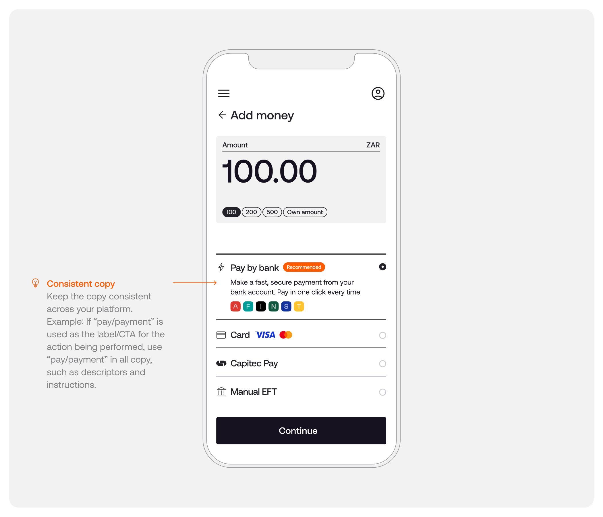
Create a standardised structure that includes:
- The goal of the payment: the language used for the call to action should match the way you typically reference payments across your brand. For instance, “Add money”, “Check out”, “Make a deposit” and so on
- A summary of the payment options available
2. To explain the payment options to users
When making a decision regarding payment methods, users need clear and concise options to select from.
2.1 Standardise the structure
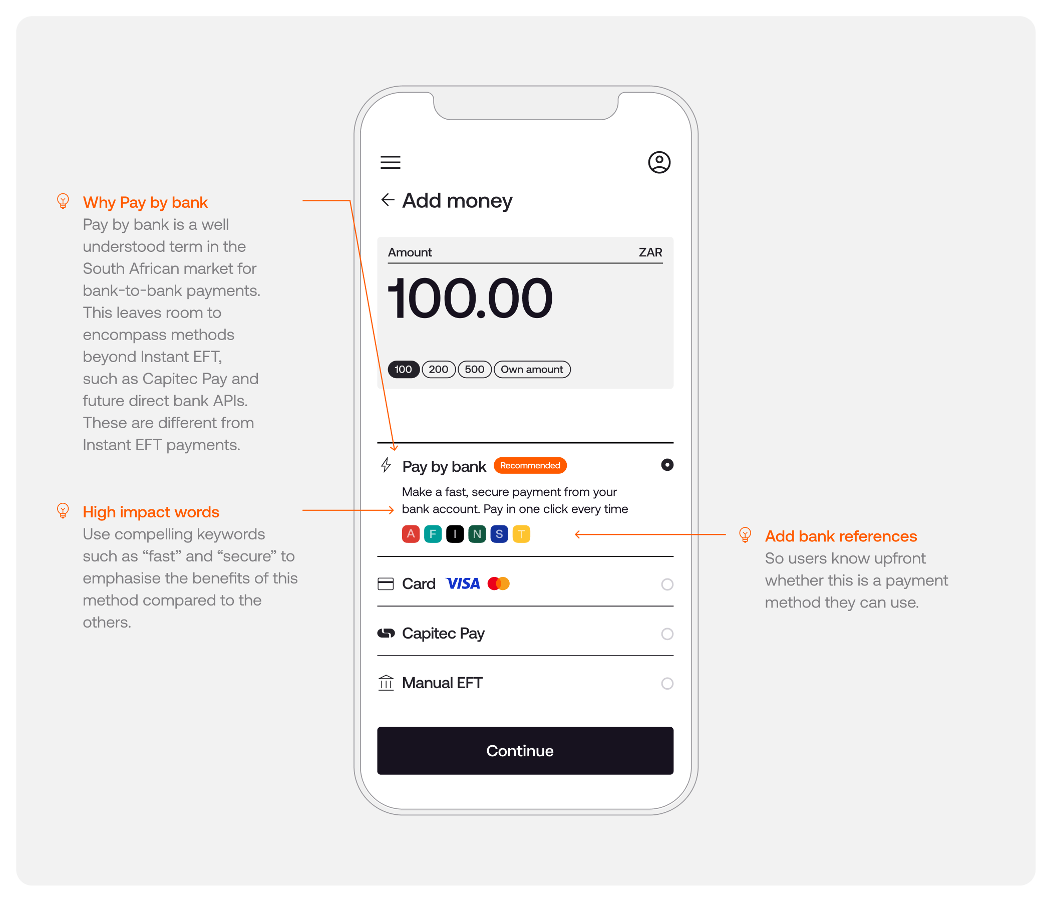
- Use icons to help users recognise the methods being presented
- Use clear naming conventions across payment methods
2.2 Explain the methods
- Let users know what to expect in the payments process
- Describe the benefits of selecting each method
2.3 Let users know the limitations involved
- Include indicators such as bank logos or references to inform users upfront whether this is a payment method they can use
3. To give users a suggested course of action
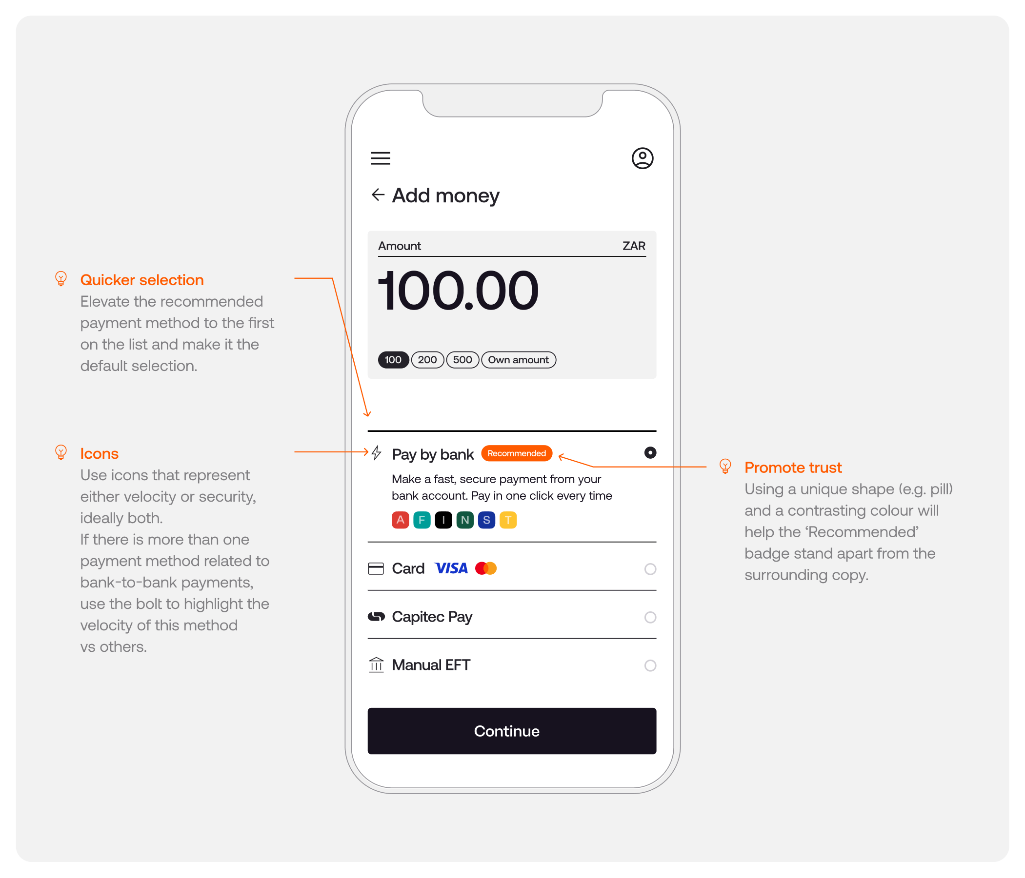
3.1 Highlight Pay by bank as a suggested method
Either recommend the preferred method in text or use a “Recommended” badge. Users will trust a new method more easily if it’s recommended
3.2 Reinforce benefits
Iconography is a great way to succinctly communicate concepts and encourage users when making a selection. In the case of Pay by bank with Stitch, it’s important to also let users know they will be able to make any future payments through this method in one click
3.3 Remove a click
By making the suggested method the default (i.e. bringing it to the top of the list), and automatically pre-selecting the option, users won’t have to click again to choose that method. This will reduce the amount of effort required and will allow users to move through the flow faster
Pay by bank: Capitec Pay UI/UX best practices
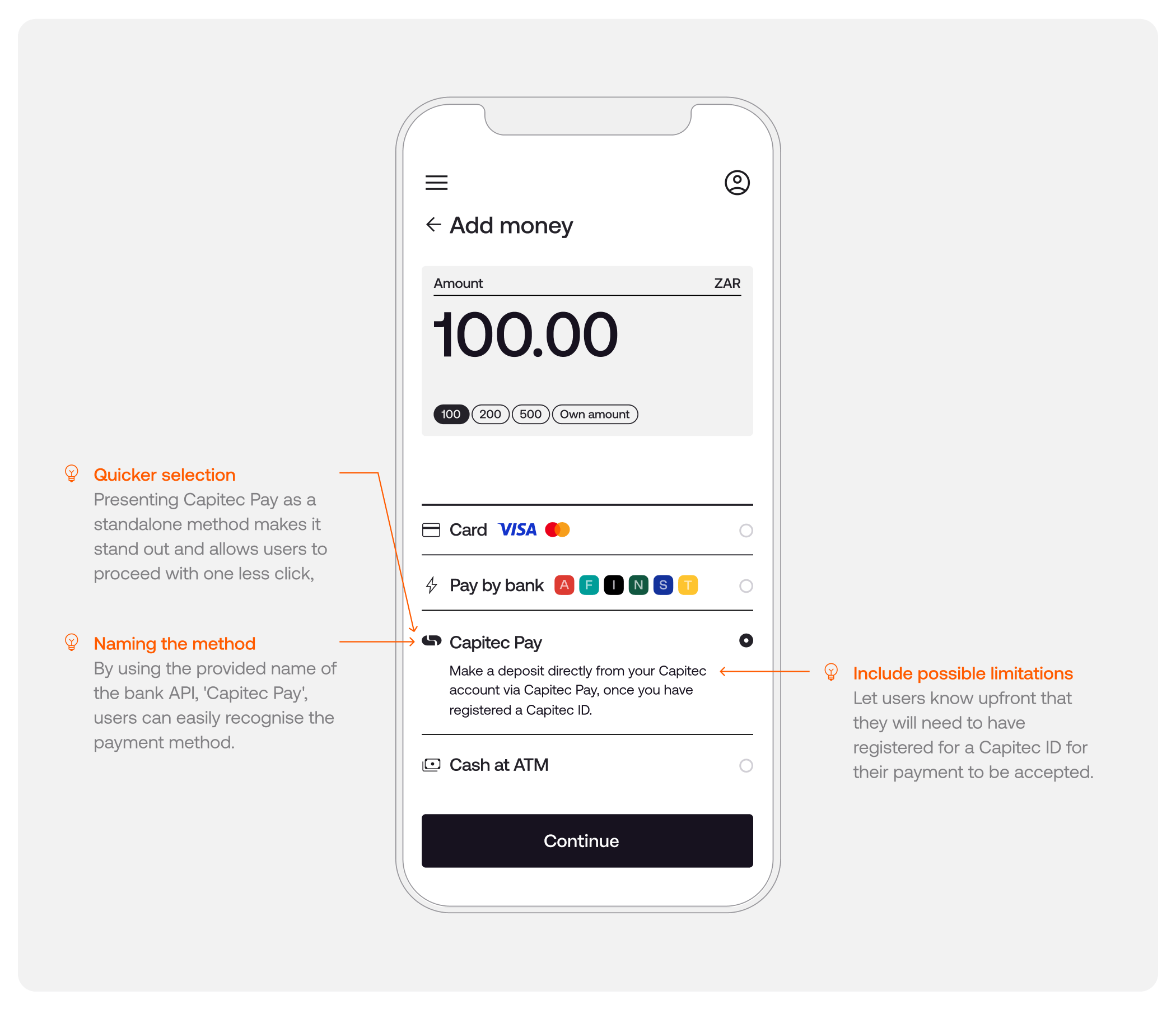
Capitec users that would like to make a deposit via Capitec Pay will need to have previously registered a Capitec Pay ID. This method is available as part of Pay by bank or as a standalone method.
💡 Enable quicker selection by isolating Capitec Pay as a payment method
While Capitec Pay can be included as part of Pay by bank, isolating the method makes it more immediately apparent that it’s available and also removes a step in the payments process for those that know they can use that method.
2.1 Standardise the structure
- Use icons to help users recognise the method being presented. For Pay by bank, we use a lightning bolt icon ⚡
- Use clear naming conventions (i.e. Capitec Pay)
2.2 Explain the method
- Let users know what to expect in the payments process
- Let users know limitations and benefits of the method (for example, that they will need to have a Capitec ID in order to use this method)
Pay by bank: success screens
For users who have successfully made a deposit through Pay by bank, the success screen has a few purposes:
1. To inform users that their deposit has been successful
2. To allow them the option to save their account details for future withdrawals (in the case of a wallet top-up platform, for example)
Confirming success and requesting consent
Once the user has successfully deposited funds, they have the option to save their account details to be used again in the future for withdrawals
On the success screen, we suggest adding a section or snack bar to:
- Indicate that their deposit was successful
- Remind users which account was used to make the payment
- Request users’ consent to save these account details for future withdrawals

Pay by bank: how to present error screens
Errors can occur at multiple points within a payment flow. For example, the user might have exited the SafeLink flow before successfully competing their transaction.
The purpose of the error screen is to:
1. Inform users that something has gone wrong
2. Give them a shortcut to a suggested course of action
For this article, we’ll use an example of an error when a user might have exited the SafeLink flow:
If a user attempts to close the SafeLink flow before they’ve successfully completed their transaction, they’ll need to confirm that they wish to exit the process and that their payment will be cancelled. If they exit the flow, they’ll need to start the process again.
Once a user has exited the flow, they should be redirected to the payments screen. In this case, it’s important to let the user know why the transaction failed and what is required of them in order to try again and finish the payment.
For a full list of possible error cases, visit our Developer Docs here.

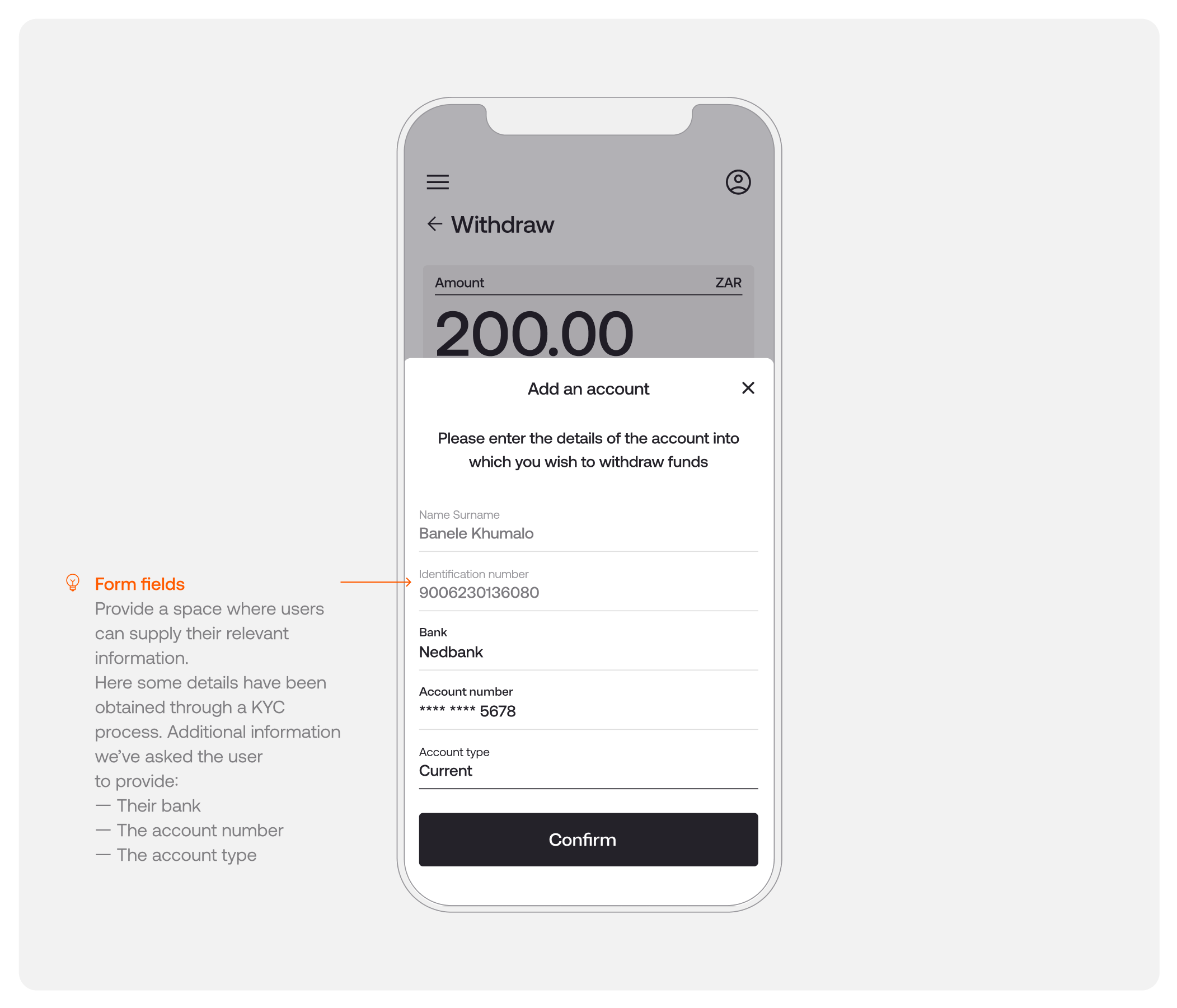
Pay by bank: manual withdrawals for first-time users
Users that wish to make a withdrawal who have not yet made a payment via Pay by bank, or who wish to withdraw to a different account than the one they used to pay in, will need to enter their account details in order to proceed.
The withdrawals screen should serve to:
1. Provide clear instructions regarding the information needed
2. Provide a summary of the transaction
The experience for users making a withdrawal should be as simple and as frictionless as possible.
Ground users by letting them know that they are required to supply additional information, and clearly identify the steps to complete a successful withdrawal:
- Explain why users are being asked for this information (i.e. to enable a successful withdrawal)
- List the information needed to complete this action
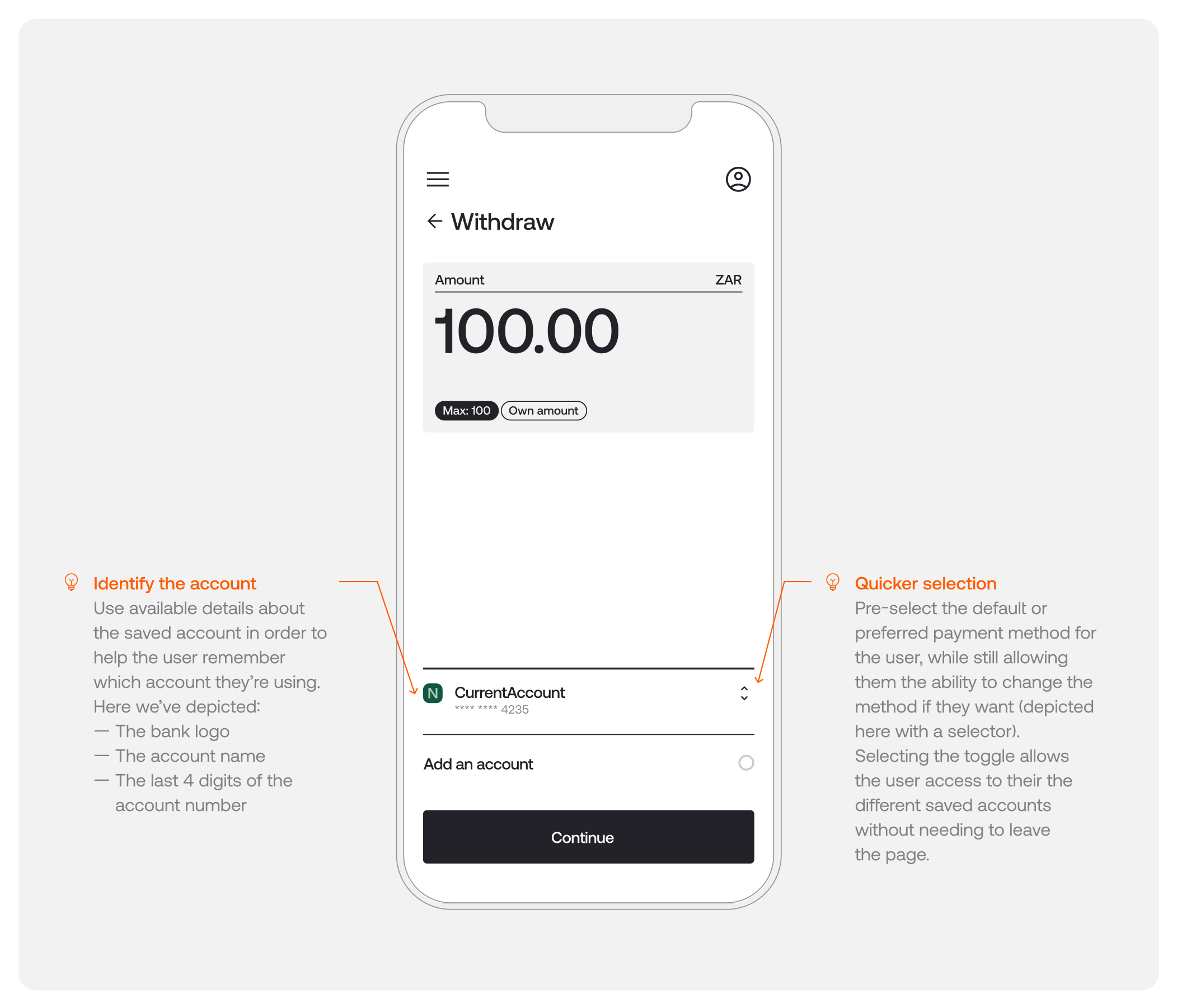
Pay by bank: withdrawals for returning users
For returning users that have previously made a deposit via Pay by bank, or have previously made a successful withdrawal to a bank account, the screen displayed before the user initiates a withdrawal has two purposes:
1. To ground users with a summary of the task
2. To give users a shortcut to the suggested course of action
Because these users have previously saved an account, you can leverage a simplified returns screen. However, it’s still important to:
- Make sure users have the option to change the account they wish to withdraw into
- Remind users which of their accounts has been saved to avoid friction or confusion
Pay by bank: presenting a withdrawal success screen
Once the withdrawal has been confirmed, let the user know when they can expect the funds.
Here, it’s important to reiterate important details including a quick overview of the transaction and whether their request was successful.
This should also include the amount they requested to withdraw, the bank details they supplied and any additional information they may need (i.e. transaction fees, the time it should take for the deposit to reach their account and any other limitations).
Manual EFT: UI/UX best practices
With Stitch, merchants can accept Manual EFTs or electronic bank transfers made via a customer’s banking app, over API. Manual EFTs offer an easy, streamlined way for businesses to collect larger payment volumes, whereas a method like Pay by bank could be better suited to smaller transaction amounts.
Before users make a payment, it’s best practice to give them key information to enable them to compare methods and choose the method best suited to their needs. This includes:
1. A summary of all payment options
2. Any additional information they may need (i.e. benefits or limitations of the method)
Explain the payment options to users
When making a decision between payment methods, users need clear and concise options to select from.
Standardise the structure
- Use icons to help users recognise the method being presented. For Manual EFT, we use a bank building icon 🏦
- Use clear naming conventions (i.e. Manual EFT or manual transfer)
Explain the method
- Let users know what to expect in the payments process
- Let the users know the limitations and benefits. For Manual EFT, we recommend including possible processing times and fees

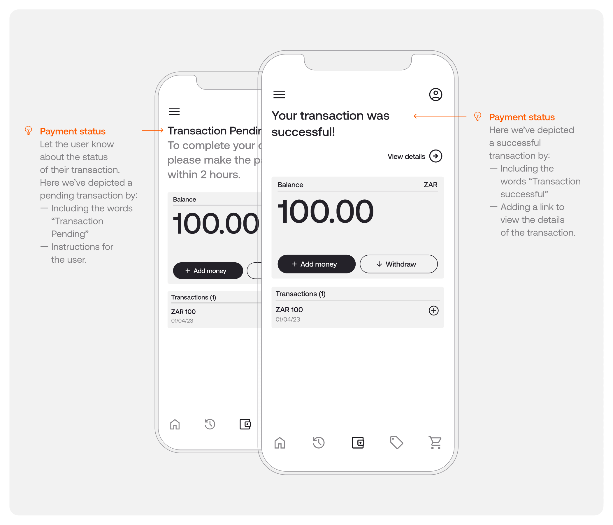
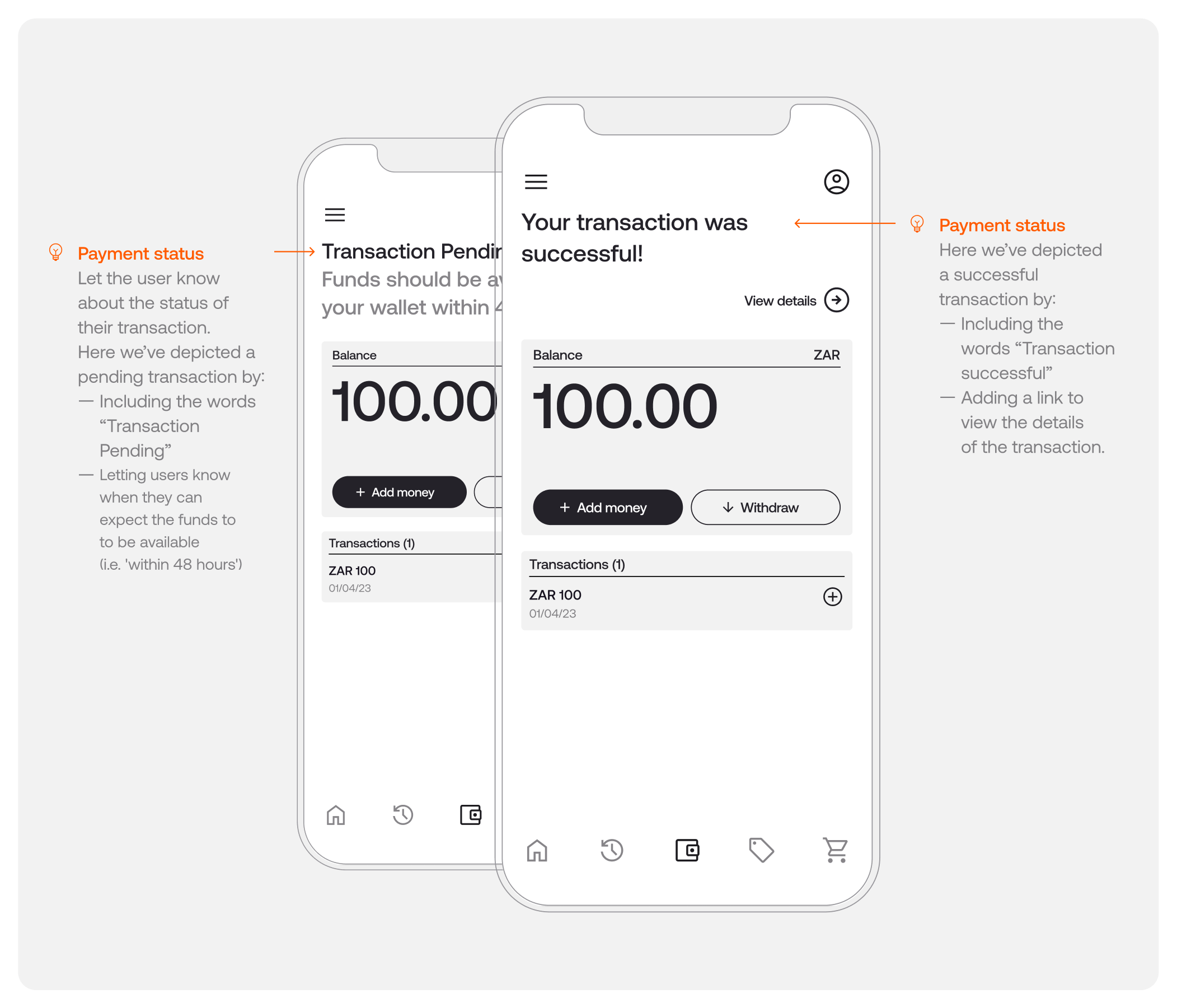
Manual EFT: progress + success screens
Users who have successfully initiated a payment and are currently waiting for it to settle should be informed of the payment status - be it pending, success or failure. The following components serve two purposes:
1. To inform users of where they are within the payment process
2. To provide a summary of the transaction
Indicating payment progress and confirming success
Add components to indicate the payment status. This is an opportunity to include as much useful information as possible, in language suited to your business.
- Pending: indicates that the transaction is still pending receipt of funds to the business
- Success: reassures users that their transaction has settled. Here, you can also provide an overview of their purchase and any potential next steps
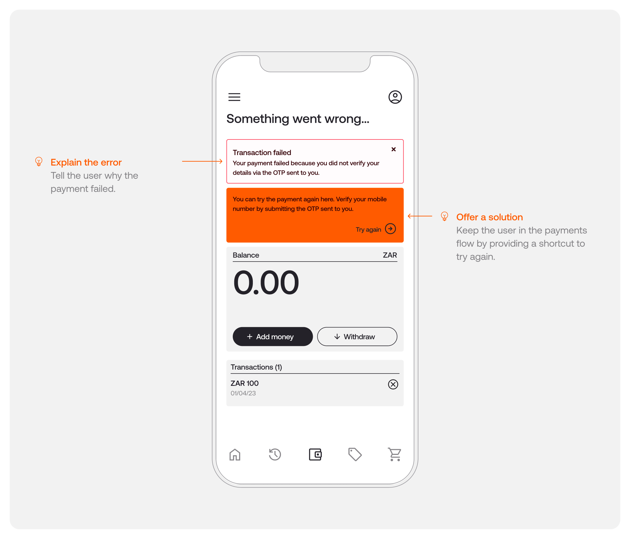
Manual EFT: how to present error screens
As with any payment method, errors can surface at a few points within the flow. For example, users making a Manual EFT payment with Stitch will need to verify their contact details. The error screen serves to:
1. Inform users that something has gone wrong
2. Give users a shortcut to the suggested course of action to fix the error
For this article, we’ll use an example in which we are unable to verify the user’s details. During the payment initiation process, the user is prompted to provide their mobile number and is required to verify their contact details using the 5-digit OTP sent to that number.
If the user doesn’t submit the OTP in the allotted time, the transaction will time out and fail. Should the user wish to try again, they will need to successfully verify their details via the OTP.
For a full list of possible error cases, visit our Developer Docs here.
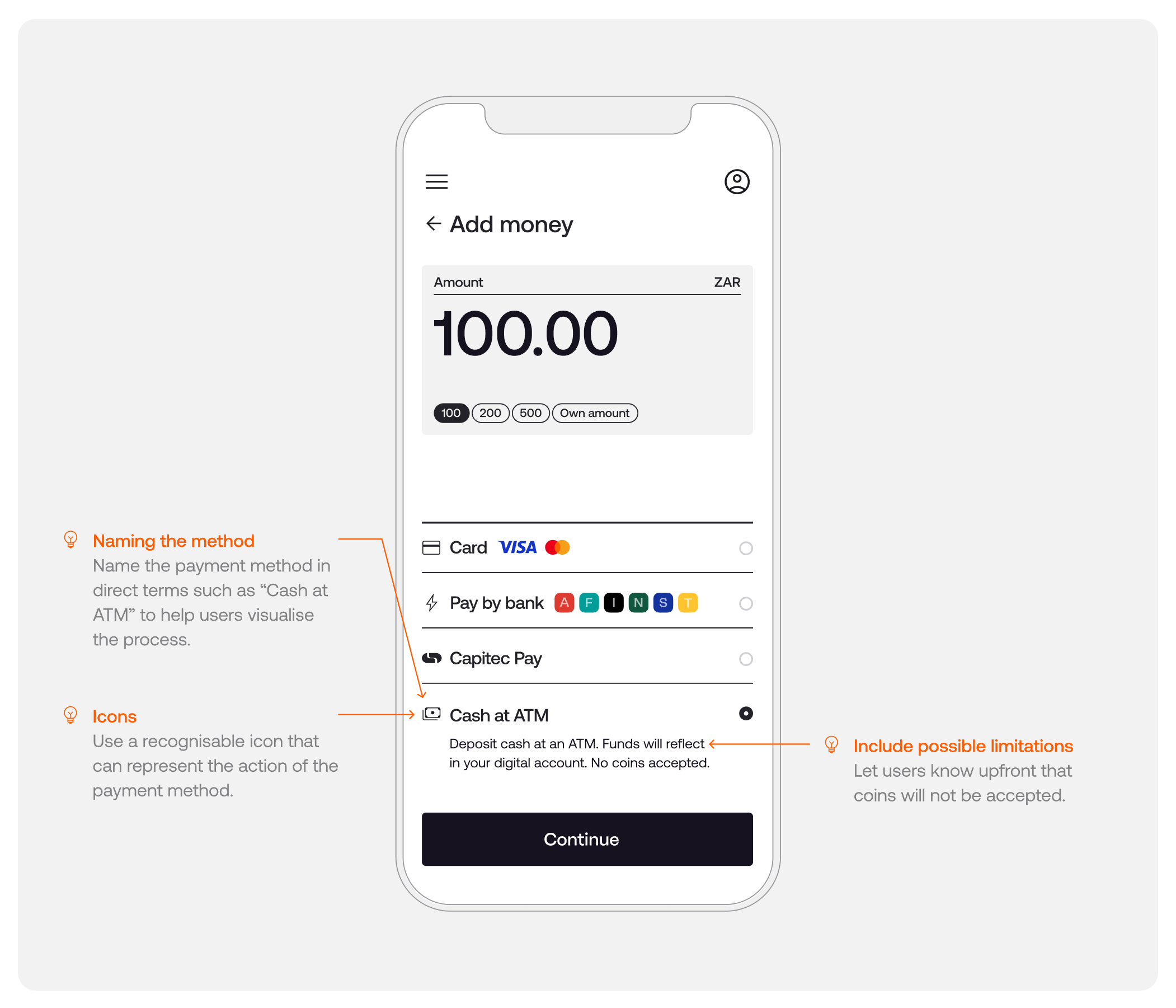
Cash at ATM: UI/UX best practices
With Stitch, businesses can reach more South Africans by accepting cash payments. Today, cash transactions still represent an overwhelming majority in the nation. Even though the banked population surpasses 85%, many South Africans still choose to withdraw cash on a regular basis and conduct transactions via cash.
Businesses can automatically allocate payments made in cash to a customer’s digital account via their app or digital platform whenever a customer makes a cash deposit at an ATM or at a retail till.
Before users make a payment, it’s best practice to give them key information to enable them to compare methods and choose the method best suited to their needs. This includes:
1. A summary of all payment options
2. Any additional information they may need (i.e. the ability to make their deposit at an ATM or select retail tills)
Standardise the structure
- Use icons to help users recognise the method being presented. For cash, we use a dollar note icon 💵
- Use clear naming conventions across payment methods
Explain the method
- Let users know what to expect in the payments process
- Let the users know the limitations and benefits. For example, some of the limitations might include the need to use bank notes instead of coins
For consumers, the ability to pay in cash offers many benefits, too. These range from the ability to access products and services online without the high fees associated with digital payment and an easier user experience as opposed to other similar solutions like vouchers.
Cash: progress + success screens
Users who have successfully initiated a payment and are currently waiting for it to be allocated should be informed of the payment status - be it pending, success or failure. The following components serve two purposes:
1. To inform users of where they are within the payment process
2. To provide a summary of the transaction
Indicating payment progress and confirming success
Add components to indicate the payment status. This is an opportunity to include as much useful information as possible in language suited to your business.
- Pending: indicates that the transaction is still pending receipt of funds to the business
- Success: reassures users that their transaction has settled. Here, you can also provide an overview of their purchase and any potential next steps
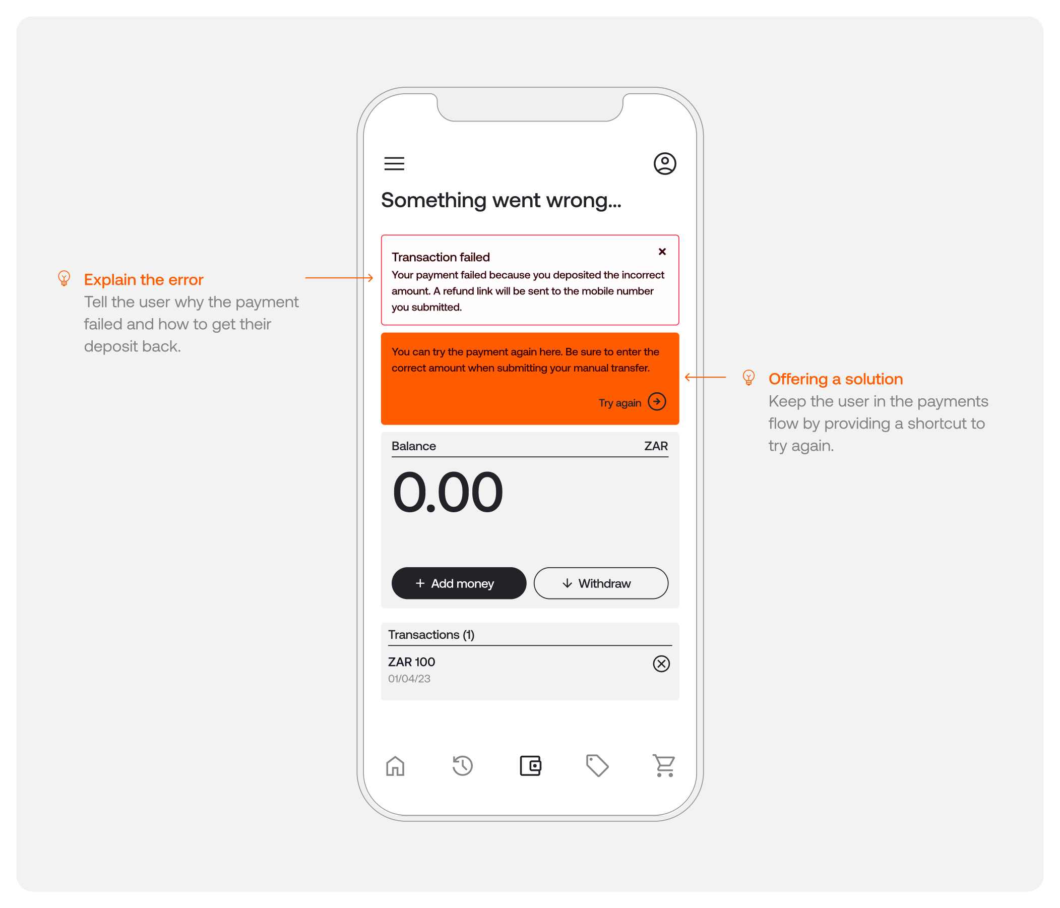
Cash: how to present error screens
As with any payment method, errors can surface at a few points within the flow. For example, the user might have deposited the incorrect amount. The purpose of the error screen component is to:
1. Inform users that something has gone wrong
2. Give users a shortcut to the suggested course of action to fix the error
For this article, we’ll use an example in which a customer has deposited the incorrect amount. If a user deposits the wrong amount (above or below the correct amount), the user’s deposit will be refunded to them, and the transaction will be cancelled.
To initiate a refund, a link will be sent to the mobile number the user submitted when initiating the payment. The user must click on the link and confirm the details of the bank account to which they wish the refund to be sent.
If this error occurs, inform the user they will receive a refund link to the mobile number they provided. Prompt the user to retry the payment, taking careful note that they’ve entered the correct amount.
UI/UX optimisation checklist
To ensure you’re getting the most out of your UI/UX implementation, here’s a checklist you can refer to.
- Create user personas to understand what motivates your customers and what each unique journey should look like
- Design different flows for first-time and returning users
- Ground users with a summary of the task on each screen
- Clearly explain all payment options to your users with a standardised structure
- Name each method and use consistent naming conventions throughout
- Use concise, consistent copy across screens, including a description of the benefits of each payment method
- Give users a suggested course of action
- Design screens for success states (i.e. when a transaction has been successful)
- Design screens for error pages and ensure there are no dead ends
- Record previous user choices (i.e. preferred default payment method) for a simplified returning journey
- Provide users the option of changing their preferred payment method or linking a new account
- Take note of customer feedback for continuous improvement
Prioritising UI/UX design in the payments process helps contribute to a seamless and intuitive experience for users. This ultimately results in higher conversion and retention rates, as well as satisfied customers who will return because of the smooth purchasing experience. It’s important to continuously monitor metrics and leverage user feedback to identify areas for improvement and refine your payments experience.
At Stitch, our UI/UX and marketing team works closely with enterprise client teams as partners, ensuring their integration and payments flow remains as optimised and seamless as possible. Get in touch to learn more.