Optimise your payments journey: UI/UX best practices for LinkPay
This article has been updated to reflect new Stitch products and their UI/UX flows – view the updated article here.

As more innovative financial products and services continue to launch and scale, customers are spoilt for choice when it comes to how they spend their money online and which financial products they use. As a result, businesses face more competition than ever.
The payments experience is a critical piece that can contribute to converting and retaining users. More than ever, customers are demanding speed, convenience and security, which means it’s crucial for businesses to offer a seamless payments experience that fosters loyalty and trust, and encourages users to complete a purchase – and come back frequently.
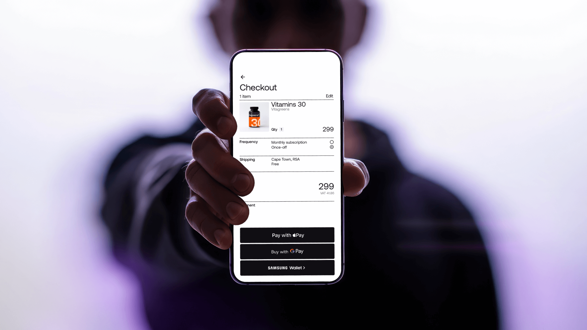
Stitch LinkPay is the first payments solution in Africa that tokenises financial accounts, enabling returning users to make one-click payments. Customers can link their preferred financial accounts via Stitch and enjoy a payments experience as convenient as card, and businesses save significantly on fees and fraud-related chargebacks. LinkPay is ideal for fintech businesses and wallet ecosystems, marketplaces and platforms and e-commerce businesses with frequent returning users.
In this guide, we’ll walk you through some of the best practices we’ve gleaned from working with clients across verticals that can help to make the payments experience even better and more user-friendly. We share these best practices with new clients as they integrate our products, and we’ve seen this result in a significant increase in conversion rates.
Using this guide
Whether you’re looking to encourage users to top up their wallets, make a deposit, complete checkout or contribute to an outstanding balance, there are certain design elements you can adjust to make it easier for users to decide which action to take.

When introducing a new payment method, it’s important to consider how to maintain a level of trust and clarity so users know their money is safe and so that they understand why they should choose one method over another. This is where UI/UX optimisation plays a significant role.
In this guide, we’ve created two scenarios for users making a payment: one for a first-time user and one for a returning user.
For this purpose, we’ll look at an example of a wallet-based fintech app, such as an investment platform, to which users return frequently to top up or add money. In this case, providing users with a payment journey that is completely frictionless and intuitive can result in more frequent and consistent payments processed on the platform.
Best practices for first-time user journeys
Here’s a look at some best practices to keep in mind when designing your first-time linking and payment journey. The following screens serve as examples of the UI your customers will engage with before they safely link their accounts with Stitch.
The screen displayed before launching a first-time payments flow has three purposes:
1. To ground users with a summary of the task
Before users initiate a payment, this is your chance to give them an overview of what the transaction will entail. This allows them to double-check the payment details at a glance and reduces the potential for drop-off.
Items to highlight include:
- The goal of the payment. The language used for the call to action should match the way you typically reference payments across your brand. For instance, “Add money”, “Checkout”, “Make a deposit” and so on.

- Keep the copy consistent across your platform
- A summary of all payment options, with clear differentiation between methods.

2. Explain the payment options to users
When making a decision regarding payment methods, users need clear and concise options to select from.
2.1 Standardise the structure:
- Use icons to help users recognise the method being presented
- Use clear naming conventions across payment methods
- Name each method
2.2 Explain the method:
- Let users know what to expect in the payments process
- Highlight the benefits of selecting the recommended method
- Use high-impact words that will resonate clearly with users, such as “instant” and “secure”
2.3 Let users know the limitations involved:
- Include the logos of available banks to set expectations


To give users a suggested course of action
3.1 Highlight a suggested method:
Either write your recommendation in text or use a “Recommended” badge. Users are more likely to try a new method if it’s recommended by the product or service they trust.
3.2 Elevate the suggested method:
Bring the suggested method to the top of the list to ensure all users will see it.
3.3 Remove a click:
By making the suggested method the default (i.e. bringing it to the top of the list), and automatically pre-selecting the option, users won’t have to click again to choose that method. This will reduce the amount of effort required and will allow users to move through the flow faster.

Best practices for returning user journeys
For returning users that have previously linked an account, the screen displayed before launching the payment flow has two purposes:
1. To ground users with a summary of the task
2. To give users a shortcut to the suggested course of action
A simplified return screen
The returning experience should be as simple and frictionless as possible. This screen should still ground users with a summary of the payment details; however, now users will see the account they’ve previously linked (i.e. the default payment method) pre-selected as the suggested payment method. They won’t need to log in again.
When setting a default payment method, keep the following in mind:
- Make sure users have the option to change payment methods if they so choose.
- The default method should reiterate the name used previously (e.g. “Pay from linked account”).
Remind users which of their accounts has been linked to avoid friction or confusion.
Display the bank and an identifying detail to make the account clear

UI/UX optimisation checklist
To make sure you’re getting the most out of your UI/UX implementation, refer back to this checklist:
- Create user personas to understand what motivates your customers
- Design different flows for first-time and returning users
- Ground users with a summary of the task on each screen
- Clearly explain all payment options to your users with a standardised structure
- Name each method
- Use concise, consistent copy across screens
- Give users a suggested course of action
- Design screens for success states (i.e. when an account has successfully been linked)
- Design screens for error pages and ensure there are no dead ends
- Record previous user choices (i.e. preferred default payment method) for a simplified returning journey
- Provide users the option of changing their preferred payment method or linking a new account
- Take note of customer feedback for continuous improvement
Practice makes perfect
It’s important to remember that UX is an iterative process, constantly demanding a re-evaluation of designs to find what really works to drive particular outcomes. Building user personas and paying close attention to actions customers take or queries received by your support team is key in ensuring the best possible outcomes for your users and your business.