Performance payments: an ambitious new direction for the Stitch brand
Stitch Creative Lead Greg Wylde talks through the thinking, inspiration and process behind the Stitch rebrand and its role in signifying our move to a growth stage business serving enterprise clients across payments needs.

Stitch exists to provide businesses open access to financial systems. The name Stitch is itself a metaphor for the connection it enables. The symbol—an abstracted pair of links—was designed to further communicate that idea, along with connotations of security and reliability.
Nearly three years since Stitch came out of stealth, we've shifted focus from an initial data play to developing payments infrastructure. The strategy was to evolve beyond offering a single payment method that resembles open banking, to building a consolidated set of products that encompasses all of a business’ payment needs. From enabling businesses to accept payments through multiple methods via the Stitch API; to orchestrating, reconciling and reporting on payments across methods, providers and geographies -- and handling complex routing of payments to external vendors -- Stitch was becoming a fully fledged payment service provider (PSP).
This evolution would take the company into a new playing field and brought with it a challenge to be addressed at both a product and brand level. In such a highly competitive industry, when finance is being embedded in almost every digital product there is, we had to think about what makes Stitch different.
Pillars of performance
It’s well-known that strategy is often more about what you decide not to do than what you decide to do, and Stitch is not a product-led company. We don’t build with a one-size fits all approach and try to make minor customisations to serve the needs of our clients. We are client-first. As we really started to consider what was important to our clients, there was a single idea that resonated: performance.
We identified some key aspects of the business that are core to the brand’s DNA. Rather than a case of having to establish new ways of operating, this was one of discovering the things we already do that we believe could set us up to win.
As our client-led approach is so fundamental to Stitch, it became the first of what we dubbed the pillars of performance – a set of principles that underpin what we do across the organisation, and that we could lean on as we developed the rest of the brand world.
The second pillar, which we refer to as precision engineering, speaks to the quality of our engineering team and the level of craftsmanship—the attention to detail that goes into all of our products—and to the fact that we’re building at the forefront of financial technology, to future-proof our clients and ensure that they remain ahead of the game.
Lastly, Stitch is not an aggregator – we operate at an infrastructural level to provide our clients with the first-party integrations to the financial systems they need to process payments with peak reliability and a high level of customisation.
Concept

The concept of performance payments perfectly summarised the brand pillars and immediately conjured parallels to the worlds of sport, technology and engineering. This differentiated Stitch in a way that felt appropriate for a business in the space. As we searched for commonalities in the highest performing examples across those categories, one insight that stood out was that (as obvious as it may seem), as a B2B company, our goal is not just to ensure our own products are performing at a high level; it's to build products that are effective in enabling better performance for our clients’ businesses.

Leaning on the sports metaphor, we looked at a powerful analogy in the form of a running shoe. It’s amazing how the intricacies in the design of a shoe for high performance athletes and the technologies that are developed in the process—from the materials to the mechanics and geometry—can enable a runner to shave a percentage off their race time. By positioning Stitch as a technology/engineering company rather than just a payment processor, it becomes elevated to a new category. It also helps define a clear objective for the new visual expression.
Constructing the brand identity
The previous brand world was a visual manifestation of the company’s journey through the stages of a startup. While the business was finding its stride, the visual identity lacked the same degree of focus and felt very much like an early stage startup targeting other startups. It was apparent that, as endearing as it was, it didn’t effectively communicate the ambition, depth and sophistication of the technology Stitch was building. It also didn't connect with the complex needs of the clients we wanted to partner with to develop the future of payments infrastructure.
It was also important in the process to acknowledge the equity the brand had built in existing assets—particularly the logo—and how, while undergoing a significant change, we could leverage this to help propel the brand into its future. For this reason, it felt more appropriate that the new logo be an evolution of the original, rather than something completely new.
Logo
The logo is a shorthand for the rest of the brand, so we looked to the codes of technology and sports brands to understand the cues we wanted to be reflected in the refreshed logo. The form of the new Stitch links is more exaggerated, sleek and elegant, and evokes a sense of endless motion. The logo is constructed from stark, geometric forms with a gesture of motion that is central (literally) to it, demonstrating a fundamental principle defined for the new identity: rigidity, disrupted by fluidity, which marries the worlds of payments and engineering to technology and sport.
Colour
Our purple colour is probably almost as recognisable of an asset as the Stitch links. So in a further attempt to leverage existing visual equity, we retained purple as the primary colour, but in the form of a slightly cooler violet. We've consolidated the supporting palette to a range of greys and reduced the accents from a myriad of neons to a single amber hue, as a warm compliment to the primary colour.

Typography
This principle also informed the typographic language—from the type family chosen as the brand typeface and customised for the revised logotype—and layouts. These are based on strict, modernist grids with the movement of the gesture always present - either directly, or referenced by additional supporting elements that comprise the system.

Iconography

The custom display typeface and iconography designed for the brand is based on the geometric structure and exaggerated proportions of the new Stitch icon, and it references letter forms associated with sports cars and aeronautics.

Illustration
The illustration style takes inspiration from technical drawings and is used to portray physical objects that are representative of the world of finance, through a detailed depiction of their inner workings. It also works to visualise abstract concepts, often in an isometric perspective.


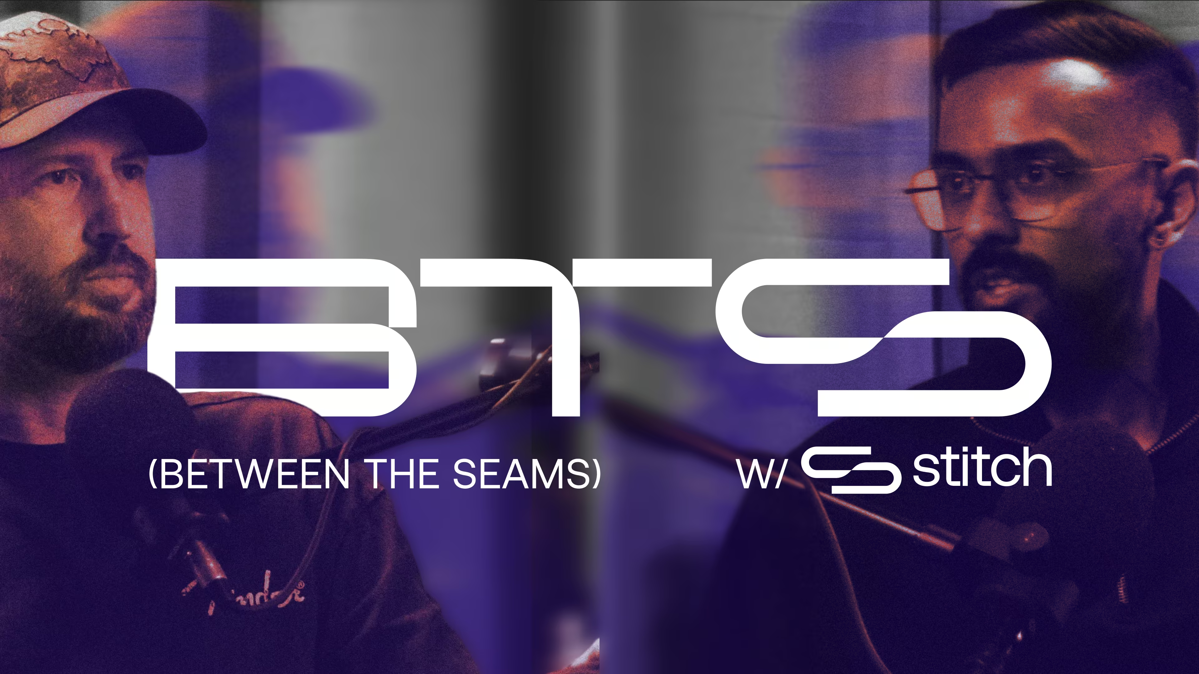
Photography
In contrast to the coldness of the illustrations, we introduced photography into the visual language that suggests a sense of motion. This includes a gradient mapping treatment that references a heat map, with the coolness of the primary violet colour and warmth of the single amber accent, also as a direct reference to performance.

The new identity system serves as a foundation for the Stitch brand and provides our creative and client-facing teams with tools that will enable them to more easily convey the Stitch value and differentiators, and as a result, help us to grow. As we scale our world-class products and service offerings, the whole organisation will continue to build equity into the assets that we hope will come to be synonymous with high-performance payments.